Child Care Cost: Bay Area
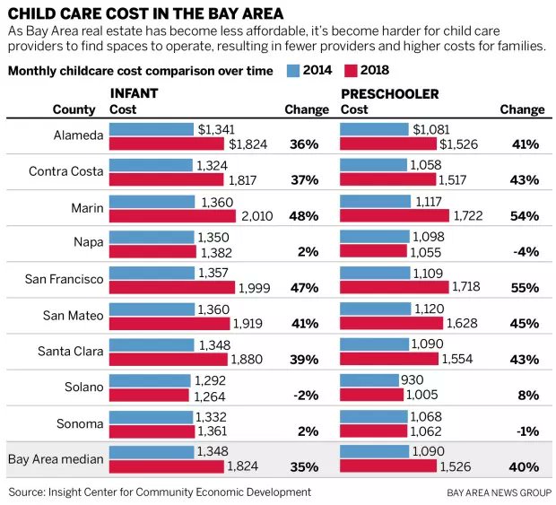
I stumbled across this exciting dataset about Childcare cost in the bay area.
Here is the graphic that I looked at:

I thought this visualization could be improved to bring the point across more clearly.
A slope chart would be a great option.
A slope graph can be used to show a ‘before and after’ story of different values, based on comparing their values at different points in time. The related values are connected by slopes.
_http://seeingdata.org/taketime/inside-the-chart-slope-graph/_
I do not do this to offend anybody, just as an exercise for myself.
Here is the resulting chart:
I think it communicates more directly which Counties were hit the hardest with increase child care cost and makes it easier to read and understand without reading the numbers.
The original article with the visualization can be found here The original source is the Insight Center for Community Economic Development. I published the data on data.world